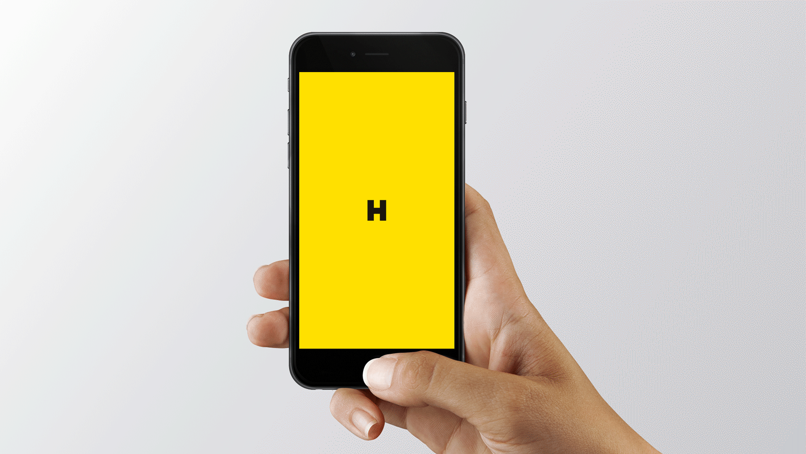
Logo
Based on a strong typography, the logo is designed for visual identification of the HOPIN brand in communication.
By adhering to the following rules, you will ensure its consistent use and memorability.
Logo colour options
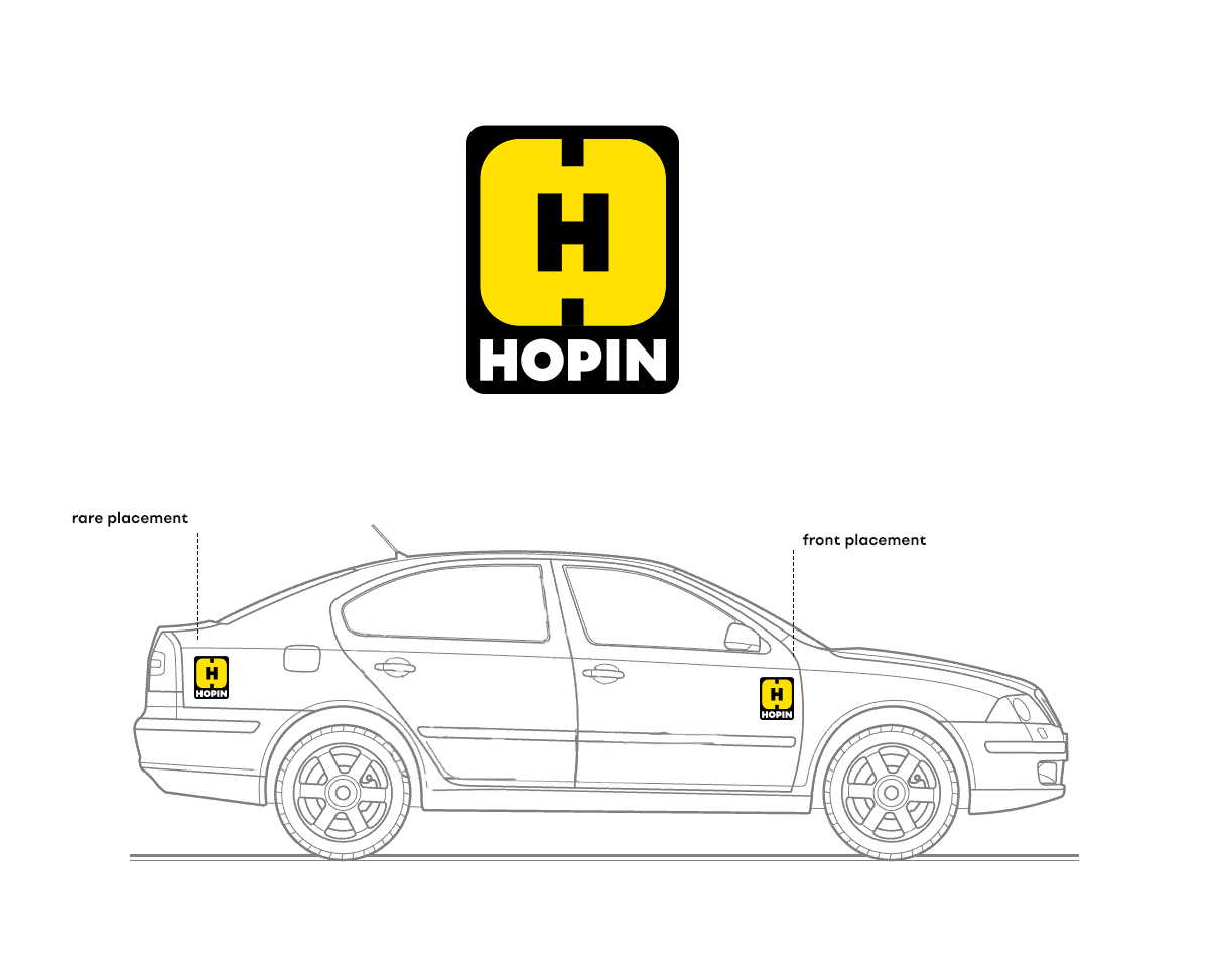
- The primary HOPIN logo consists of a black logotype on a yellow background. To ensure the brand’s memorability, do not use any of the secondary colours as the background colour.
- The yellow version of the logo on black background may only be used for the communication of HOPIN BUSINESS activities.
- If technical reasons prevent the use of the logo with a yellow background, use the black or white version of the logo.
download:
HOPIN-logopack.zip
Exclusion zone and minimum size of the logo
- If you are using the HOPIN logo in combination with other graphical elements, make sure that the minimum exclusion zone is maintained. The exclusion zone is defined as half of the letter “O” in the logo.
- To ensure legibility, the minimum logo size allowed is 60 px for online use and 20 mm for printed materials.
Tagline and spelling
- The logo can be complemented by a tagline, which uses the Setup Grotesk Regular font. When varying the tagline, make sure to maintain the distance from logo and correct spacing.
- In text form, always use the HOPIN wordmark with all capitals.
- In official written communication, we recommend not to decline the word HOPIN (correct: Jazdite s HOPIN. incorrect: Jazdite s HOPINom / HOPINOM / HOPIN-om).


Social media
The identity on social media will be based on strong typography, yellow colour, and playing with the road pattern, or connecting different parts of visuals with the use of lines.
download:
HOPIN-fb-assets.zip